2024 marks the fifth season of the Eye Test covering the NRL with this site’s advanced statistics. I have no idea how I made it to five seasons, especially after whatever 2021 was. But somehow I’ve made it through to the other side and I’m happy with how the advanced statistics have been working.
Mostly.
There’s one comment I regularly get about the Eye Test’s Run % metric that always sticks in my head. Which is that it doesn’t judge the quality of that run, just the quantity. The metric just shows (as a percentage) an estimate of how often a player completes a run, irrespective of the length.
If a player is making a run on 20% of their teams play the balls, or one in every five plays, that might be useful to know, but it sheds no light on how good those runs were. The average metres per run could be 1m, and if it was, the value of those runs would be immensely negative given how strongly run metres correlates with scoring points and winning matches.
Sure, I could use run metres as a proxy, but how do you compare a 15 metre first tackle kick return from Dylan Edwards to a strong 12 metre hit up by James Fisher-Harris on the fourth tackle? They’re completely different situations that should have completely different goals and outcomes. Is there a way we could judge the quality of a run?
Enter expected run metres.
Methodology
If you’ve been following the site for a while and understand the Eye Test’s expected points model (ETXP), then you’ll be familiar with this. To start, I’ve grouped their starting locations of a run to the same 4×4 metre square buckets used for my expected point model (ETXP) to give each area a significant enough sample size to work with considering the other factors involved.
Using this starting position, as well metres gained, and tackle number of every run in the past five NRL seasons, I’ve built a regression model that estimates how many metres a ball carrier is expected to make based on these variables, as well as whether the run was made by a back or forward since they have different outcomes.
To put it more simply, if an average player started a run from the same situation based on location and tackle number, and whether the run was started by a forward or back, how many metres should they have gained?
If you’re an NFL fan and thinks this sounds a bit like Rushing Yards Over Expected, you’d be right. It’s a similar concept but my model is far simpler than any that are used for the NFL, although the principles are the same.
Here’s an example of how it works. If James Tedesco started a run 25 metres out from his own goal line, and 25 metres in from the right sideline on tackle 1, the expected metres gained from that run is 9.18 metres. If he attempted a run from 55 metres out, 25 metres in on the 3rd tackle, the expected metres would be 8.37 metres. From there we can compare his actual output to what the expected values are and quantify if the run he made was above or below the metres he “should” have made.
As with previous models I’ve created, I know there’s some flaws and areas for improvement already. And again, I’m not going to let perfect be the enemy of good and there’s still some extremely interesting results coming from this release, which I’d class as an early beta. For now, the correlation between run metres and expected run metres for season 2023 lines up well with an r-squared of 0.85, which I’m quite happy with for a first pass.
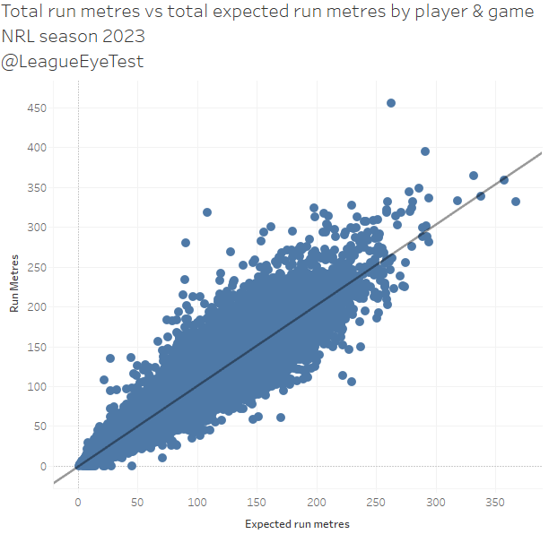
Now using this, we can estimate the expected metres from different locations and situations on field, how do we apply them? The most obvious is determining the quality of individual runs. Who is regularly gaining more metres than expected? We can also look at how each team fares, are some teams giving up more metres than expected? Let’s start off with some player evaluations.
Individual metrics
The first way is to look at total Run Metres Over Expected (RMOE), which is how many run metres they gained above their expected run metres. Here’s the top 25 by total RMOE, with a threshold of 100 runs.

Canberra centre Matt Timoko led the NRL last season, earning 727 metres more than expected. That was ahead of Penrith’s Brian To’o (+609m over expected), the Roosters’ James Tedesco (+573), Newcastle’s Dominic Young (+504) and the Dolphins’ Jamayne Isaako (+502m). Another Raider in Joe Tapine (+431m above expected) was the highest ranking forward by this method, and Jason Taumalolo is the only other forward inside the top 20.
I don’t particularly like this way of expressing performance as it rewards players who make a lot of runs and/or play more games. If you look at this list, it contains a lot of backs who are benefiting from playing the full 80 minutes, being put into open space, and to a lesser extent returning kicks.
Instead, I’d rather focus on a metres over expected per run (RMOE/run) value than overall which removed the benefit of running the ball more. You know how we roll here – rates over volume or raw counting stats.

Now here’s the top 25 players by RMOE/run above expected, again with a threshold of 100 runs.
Manly winger Jason Saab moves up into top spot here, averaging a stunning 2.38 metres per run higher than expected. There’s two ways of interpreting this. Either Manly gets Saab into space very easily, allowing him to easily eclipse his expected gain, or he does extremely well bringing the ball off his own goal line after a kick (and we’ll answer this one a bit later). Either way, he’d be adding an extra 24 metres for every 10 runs completed over an average back starting a run given the same situations.
Timoko drops down to second here, averaging +2.12 RMOE/run, the only other play to beat his expected gain by more than 2 metres per run. Brisbane’s Corey Oates takes out third place with an extra 1.88m added over expected to his runs.
This list is still headed by outside backs, but there’s a good distribution of forwards in there as well with big men coming in at #6, #9, #10, #21 and #22. Royce Hunt is the highest of those, with his 1.63m per run over expected the best of any forward in 2023. Taumalolo was 9th at +1.58m RMOE/run and another Shark (and future Warrior) in Braden Hamlin-Uele 10th with +1.52m. There’s a third Shark inside the top 25 as well with Jack Williams placing 22nd at +1.19m. As much as Cronulla crumbles against top eight teams, a few of their forwards know how to squeeze every late bit out of a run.
At first glance you might think RMOE or RMOE/run are heavily influenced by kick returns, either in general play by outside backs, or by forward hit ups from a kick off. To some extent it is, as someone like Will Kennedy had nearly half his runs and metres come from kick returns. But Timoko made only a handful of them all season, as did Bradman Best, Valentine Holmes, Izack Tago and Herbie Farnworth.
It might have some influence on it but it’s not a driving factor. Part of it is that kick returns being longer is already baked into the model. If a fullback is starting a run 10 metres out and 20 metres in from the left sideline on tackle one, the expected metres from that run is going to be higher than a run from the same position on any subsequent tackle, which cannot occur on a kick return. In this example the difference in expected metres is 10.50 metres to 7.72 metres, because the model knows that runs on the first tackle closer to the goal line are usually longer than runs on subsequent tackles.
The same applies to forwards attempting runs from a kick off, the expected metres from a run starting around the one metre line (or even the in goal area) on tackle one is substantially higher than a forwards’ run starting from the same location on tackle two or later.
Therefore, players who return kicks might have the advantage of making longer runs but the expected metres from that situation is also longer, which is why I’m focusing on measuring the gap between those two numbers. And also why I’ve split this metric by backs and forwards (for now).
That should hopefully explain why any impact returning kicks has on this metric is minimal at best. I could probably even the playing field further by removing kick returns but they’re still a form of run and that’s something to revisit in later revisions.
We can also look at the players with the lowest RMOE/run. Here’s the bottom 25 players with at least 90 runs. I had to lower the threshold slightly for negative entries as (shockingly) people who don’t run the ball well generally don’t make as many runs.
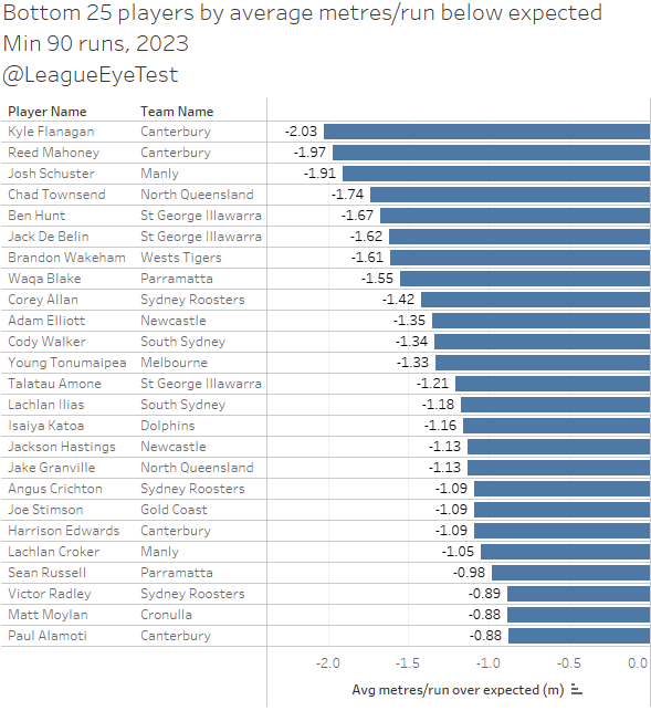
You’ll notice a trend with this list. There’s a lot of halves (Chad Townsend, Brandon Wakeham, Cody Walker), dummy halves (Reed Mahoney, Lachlan Croker) or players who split time between both (Kyle Flanagan, Ben Hunt). Flanagan has already been noted as having the lowest tendencies to run with the ball in the NRL, so his presence at the bottom of this list isn’t surprising.
For those players, this list is more reflective of their role focusing on distribution and/or play making first, which is why context matters so much when analysing statistical value in rugby league.
That said, there are several players from other positions that are usually relied upon more for yardage who are clearly not hitting their expected metres. Jack De Belin, Victory Radley, Adam Elliott and and Angus Crichton are the most notable, although the first three probably spent some time playing as the link man so that could explain their under performance. Crichton’s decline last year was been noticeable, as he was +0.38m RMOE/run in 2022 and +.15m in 2021 above expected metres.
Eels fans wouldn’t be surprised to see Waqa Blake appear here, but he’s not the only centre or wing to fail to match his expected metres. Corey Allan, Young Tonumaipea, Sean Russell and Paul Alamoti also ran at least -0.88 RMOE/run, with most missing the mark by at least one metre.
Plotting these numbers on a box and whiskers plot by position, which shows the maximum, minimum and mean of each group of numbers, as well as splitting them into quartiles, can help show the variation of performances. The below chart is every NRL player with at least 80 runs from 2023.
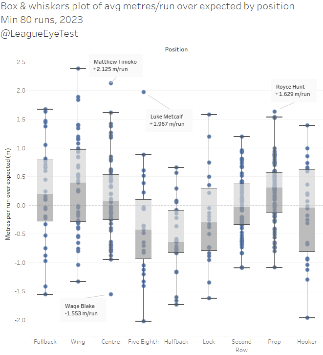
It’s now a lot easier to see how the players running above expected metres are distributing within positions. A position like prop has only a handful of players near the top whisker, but an even spread around the middle quartiles. Positions like second row and centre have somewhat more of an even distribution between the four quartiles.
This chart also shows just how big of a negative outlier Blake was last season at -1.55 RMOE/run, and how positive Timoko and Hunt were for their positions. I also lowered the threshold slightly to 80 runs to highlight Luke Metcalf having the best RMOE/run performance over expected of any half (#6 or #7) and show he was a huge outlier.
Metcalf eclipsed his expected metres by 1.97m per run, while no other half gained more than 87cm over expected per run – the next best being Ezra Mam. A running half like that is the perfect complement to the genius that is late career Shaun Johnson.
The next way we can apply these expected run metres is to work out the percentage of runs where a player gained more metres than expected, which can show how consistently players are beating that mark.
Below are the top 25 players by the percentage of runs they make that achieve more than their expected metres.
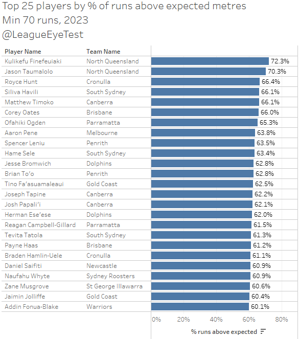
Cowboys back rower Kulikefu Finefeuaiki takes first place here with an impressive 72% of runs great than the expected metres. His team mate Taumalolo is next, which again quantifies how impactful he is. Eighth in the NRL for RMOE/run, and second in percentage of runs above expected length. No one else comes close to that sort of consistency.
Below the top two there’s a smattering of outside backs like Timoko, Oates and Brian To’o, as well as some of the harder working middles like Hunt and Spencer Leniu, both of whom are usually high on my Run % metric. If RMOE/run is the domain of backs, then percentage of runs above expected metres is the realm of forwards.
This number is more useful for looking at the consistency of quality runs than the length of them. There’s an inherent bias for outside backs when using distance gained over expected as they’re usually being put into space by their play makers or taking advantage of tired defenders. One 80 metre break can greatly influence their metres over expected. Most middle and edge forwards are being sent straight into the defensive line and aren’t as fleet of foot. The forwards on the above list consistently gaining more metres than an average player would. It might only be by a few centimetres per run but they’re doing it regularly.
I’m going to hang on to the bottom 25 chart for this metric until a bit later which will make sense when we get to it.
We’ve seen so far which players have beaten their expected metres per run so far, but what we can also learn is where on the field they’re likely to do so.
The previous charts showed Taumalolo is one of the better players at beating their expected run metres. But where on the field is he most successful? Below is a heat map showing where he is above or below expected on field. Remember each box here represents a 4×4 square where the run was initiated from. A blue square indicates the player’s average run metres over expected is positive, and an orange square indicates it’s negative.

Mostly through the middle of the park as you’d suspect with plenty of blue. Taumalolo is pretty much guaranteed to beat his expected metres no matter where on the field he starts his run from. Nothing really surprising here.
Next we’ll check Jason Saab’s heat map. Keep in mind earlier that we hypothesised that either Manly get him into space easily or he runs the ball extremely well coming out of his own area. Let’s check out how his on field chart looks. Now we can see exactly where his extra metres are coming from.
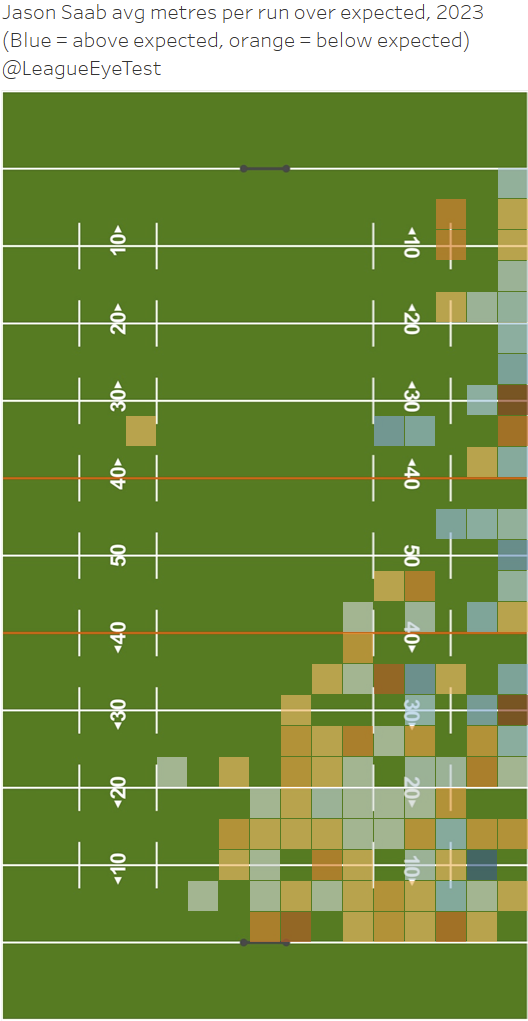
Now we can see it’s mostly coming from runs down the right touchline, with very little coming from early hit-ups out of Manly’s own area. Nothing that we couldn’t have uncovered from looking at multiple videos, but it’s useful to see all of this information in one place.
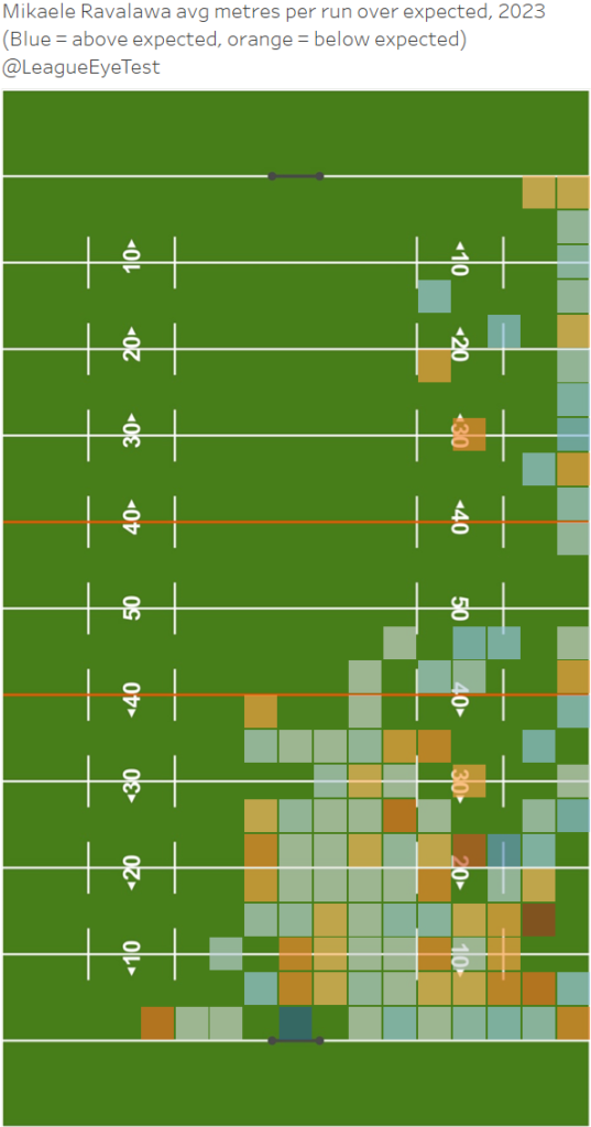
We can also uncover an interesting tale of two players with the Dragons wingers from last season. Firstly, here’s St George Illawarra winger Mikaele Ravalawa’s chart, showing that like Saab he was dangerous down the right flank.
Now here’s his opposite winger, Mathew Feagai, showing exactly the opposite on the opposite side of the field.
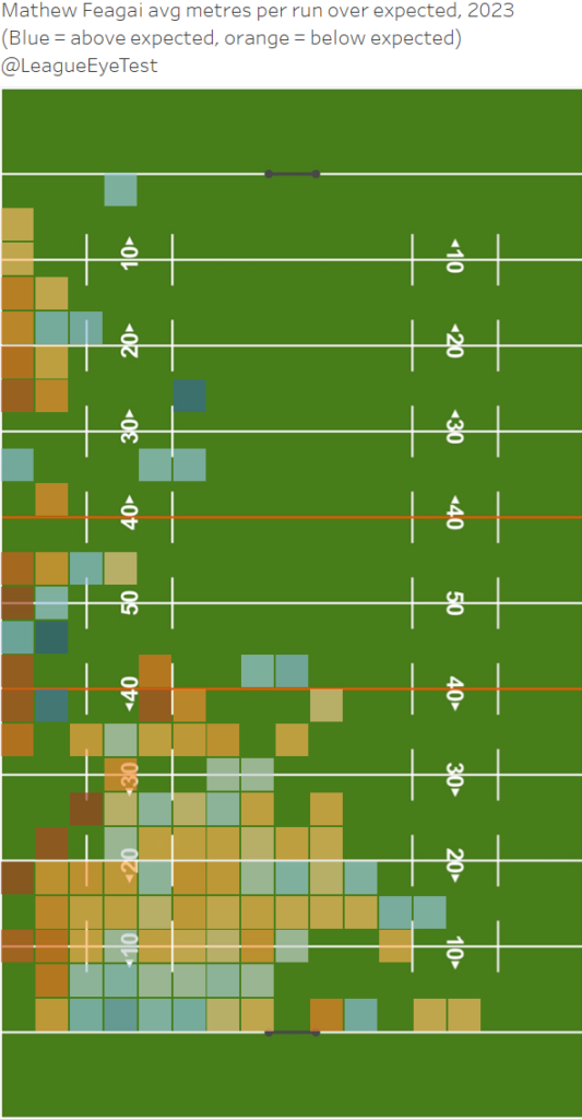
It would be nigh on impossible to find two wingers with such contrasting charts (and believe me I tried). Almost every touch Feagai had down the left side was well under the expected metres from a player in the same situation. That’s not a knock on Feagai alone, it’s his halves job to get him into space and put him into a position to succeed.
Yet on the other side of the field, almost every time Ravalawa touched the ball he made more metres than expected, especially closer to the line. You could argue from this that the Dragons should have just constantly fed the ball down the right side of the field, but they would run the danger of becoming predictable. But clearly their attack down the left side of the field in 2023 wasn’t productive.
I’m somewhat hesitant to use these charts for individual players as they’re very prone to small sample sizes given how often players start a run from certain locations, some of which are a one or two runs at best. But for a proof of concept, it works well and over a multiple season span would be less susceptible to outliers. I’m including them here just to show what could be possible using this model.
Team metrics
We can also look at this from a team perspective. First up is the total RMOE for 2023.
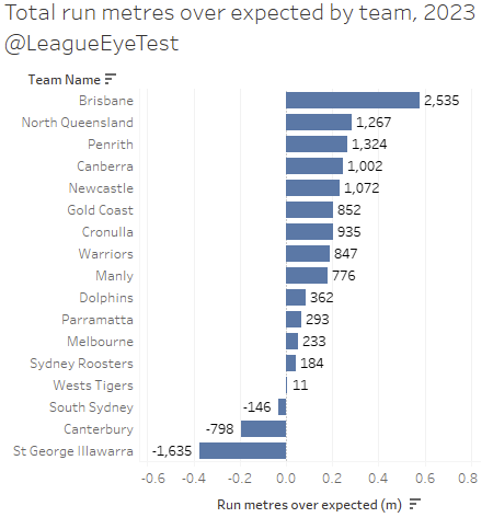
Brisbane gained over 2,500 RMOE last season, well ahead of second placed Penrith at just over 1,300 RMOE. At the opposite end of the scale, the Dragons and Dogs had the biggest issues making more metres than expected in 2023, which should surprise no one.
But like the player specific charts, this one is very much dependent on volume of possession. To remove this, we’ll again normalise it on a per run basis. Below are the RMOE/run results by team for season 2023.

Looking at it on a per run basis, the Broncos still come out on top, averaging 0.59 RMOE/run last season. The Cowboys push into second place, adding 0.29 RMOE/run, and once we account for volume of possession it’s not surprising to see the Panthers slide down to third beating their expected metres by 0.26m per run.
The bottom three teams don’t change either, with the Dragons and Dogs failing to hit their expected metres per run by 37cm and 19cm respectively. South Sydney’s struggles making metres again can be seen here as they averaged 3cm fewer than expected per run and were one of just three teams not to make more metres than expected. We’ll get more into the Rabbitohs troubles getting downfield shortly.
And similarly, here’s how many metres per run each team is conceding above or below expected for 2023.
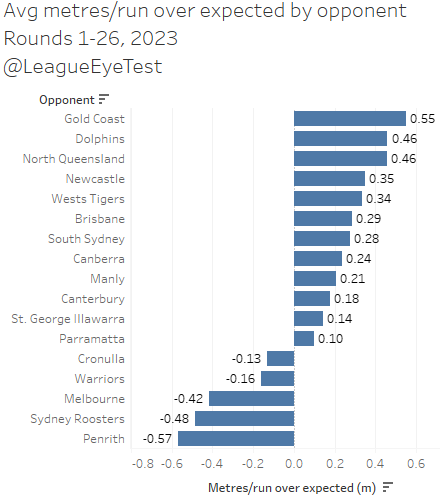
Given how they capitulated when holding a lead last year, the Titans allowing the highest average metres over expected at 0.55m checks out. Half a metre may not sound like a lot but when you add it up over 130+ play the balls per game it becomes meaningful.
No surprises that the teams that had the better defenses in the competition also had the biggest gap between expected metres per run allowed and actual metres per run conceded, with Penrith beating that mark by over half a metre. We knew the Roosters defense was strong as well last year, but that wasn’t where they stumbled.
Newcastle is the outlier here at 0.35m RMOE/run allowed over expected, which is fourth worst in the NRL for 2023. But if you limit this data to Round 12 when they started their turnaround, they would be basically even on metres allowed and firmly mid table. Their defense in the second half of the season was almost elite, as noted on this site previously.
Interestingly, St George Illawarra and Canterbury sit mid-table here, which could indicate that their ability to control yardage wasn’t that terrible. They were quite close to their expected metres conceded, only giving up an extra 14cm and 18cm respectively. The reality is that it’s probably a function of where they allowed their opponents to run the ball than defensive ability, as the closer to the goal line you get the fewer metres there are to gain.
The advantage of looking at this from a team point of view is that we don’t suffer from small sample sizes when looking at where on field each team is over or under performing.
For example, here’s the map of Penrith’s run metres conceded against expected for 2023, which shows where they restrict teams to fewer metres than expected (orange), or allow more than expected (blue).
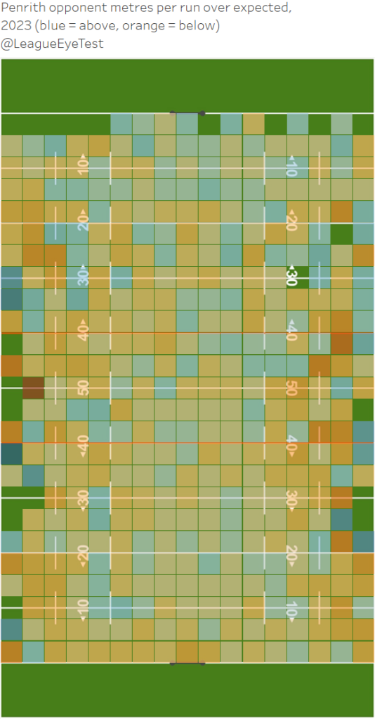
That’s a lot of orange.
And here’s South Sydney’s run metres gained against expected for 2023, which shows where they are struggling to make yardage out of their own half (orange squares).
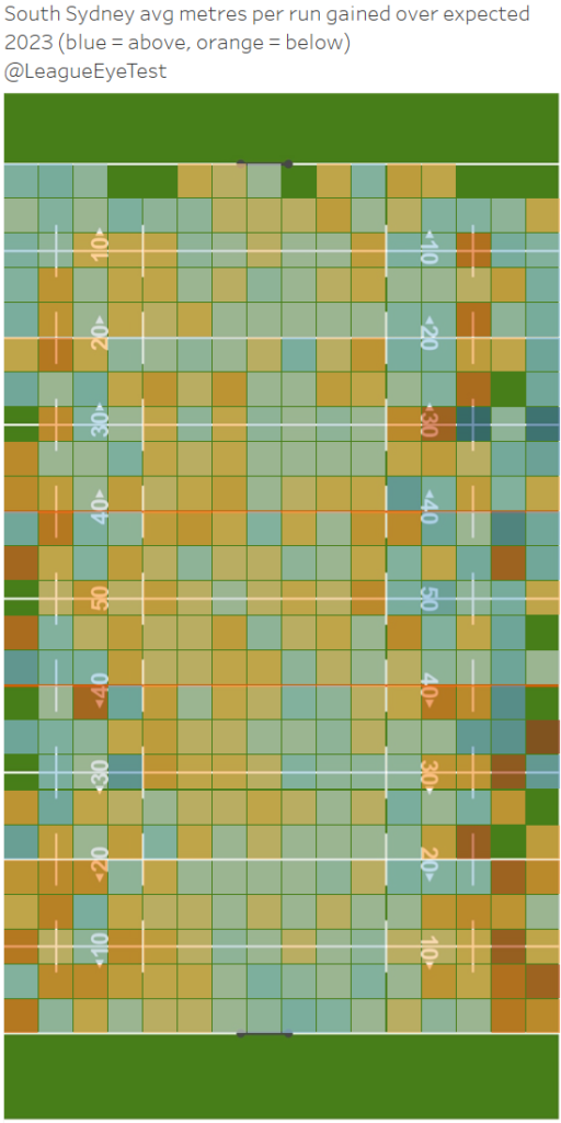
I’d highlighted previously that Souths have one of the worst starting points for first play the ball location in the NRL last season, and this chart shows why it’s an issue.
If you look at both corners close to the Bunnies’ try line at the bottom of the field you can see it shaded more orange (bad) than blue (good), and some very deep orange as well. This indicates South Sydney are not only averaging below expected metres in those areas, but they’re also quite some way under it.
Closer to the middle of the field inside their own 20 metre zone isn’t too bad, which suggests they would start their sets better receiving the ball in the middle of the field. Of course, no opponent is going to willingly give them the ball in that situation, but the ability to pinpoint it is useful.
Part of this issue is that Izaac Tu’itupou Thompson (+0.84m) and Campbell Graham (+0.96m) were the only Souths backs who had any substantial level of RMOE/run, and Tu’itupou Thompson played fewer than ten games. Latrell Mitchell and Taane Milne were in the positives as well but only by a handful of centimetres last season, which was a recent low for Mitchell.
Most of the successful teams from prior years had multiple regular backline players, usually from their back three, producing more metres than expected per run. Now with news of Graham missing half the season due to a sternum injury, there must be real questions about where these metres are going to come from for the Bunnies.
In addition, their halves (which aren’t strong running positions across the NRL to begin with), are well below average here. We saw before that both Ilias and Walker in the bottom 15 overall for metres over expected. In addition, Walker has the lowest percentage of runs longer than expected of all players in the NRL for 2023 (see below), and Ilias was sixth lowest.
Here’s the bottom 25 players by percentage of runs above expected for 2023 that I promised earlier and this is why I held on to it for a bit longer.
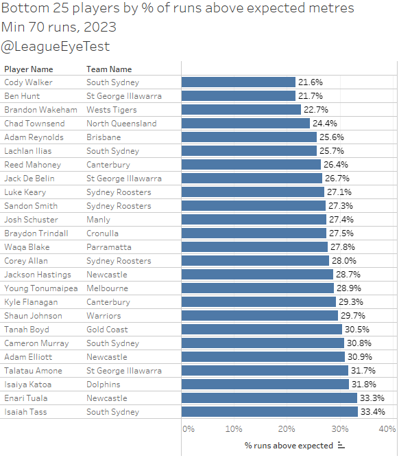
When Walker did run the ball, only one in five times did he do so further than an average player would be expected to. Ilias wasn’t much better, eclipsing his expected metres just one in four times. Yes, those positions aren’t usually defined by regular long runs and the roles Walker and Ilias play aren’t focused on running the ball. However, Souths’ halves posed little threat to run the ball successfully compared to every other team in the competition, putting even more pressure on the men outside them as defenders can just play for the pass or kick. You can’t be this one dimensional and succeed in the NRL.
I’m probably only scratching the surface of what we can do with this model, and this should give you a picture of the types of analysis we can look at. Hopefully we’ll be able to uncover some new trends during the 2024 season using it.
Limitations of this model
Some players are playing a role where their primary goal isn’t to gain metres. If you look at the list of players who run less than expected, most of them are either organising halves or dummy halves who are just there to (theoretically) provide good service. That someone like Nathan Cleary runs 7% fewer metres than expected shouldn’t be seen as a negative, it’s just an aspect of the role he’s playing and that making metres isn’t the focus of his role.
Hookers generally don’t run the ball, and are largely asked to provide good service from dummy half. They have by far the biggest negative gap between expected and actual run metres. Halfbacks and five eighths also are primarily organisers or facilitators, and locks are usually playing the vital role of link man in attack.
Below is the same scatter plot from earlier in this post showing the correlation between metres per run and expected metres per run, with hookers highlighted.
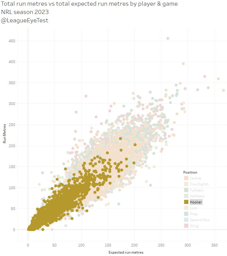
This is another example of why understanding a player’s role and how it impacts their production is vital when talking about statistics in rugby league. The statistic only provides a data point, but the real value lies with adding context to it.
Like my other metrics, comparisons within positions are where the key insights lie, and if you look at the bottom 25 players, there’s some key takeaways as we saw above with the Rabbitohs halves and metres above expected.
You can see how low most of the hookers fare in this chart. Other positions with a focus on distribution and play making like halfbacks, five eighth and to a lesser extent locks, also perform poorly here.
Clearly there’s more work that could be done to improve the model and take these sorts of issues into account. Speaking of which…
Future Improvements
As mentioned above this is something I’d consider a beta release. With more time and data I could potentially improve the accuracy and usefulness of this model. I’ve only gone back five seasons, adding in more would make the model stronger due to the law of large numbers.
By adding in more data, I could use game state, individual positions, or any other number of variables. Individual positions would resolve the issue of hookers being compared with ball running forwards, or halves being compared with wings, centres, and fullbacks who are the players they’re trying to get into open space. Weighting down kick returns is also an option, even if it isn’t substantially impactful as discussed above.
I also mentioned game state was something I wanted to include, as teams protecting a lead are probably less focused on getting down field than with playing safe football.
There’s also the opportunity to build a more robust model using something like XGBoost, but again outside factors are the limit here and I’m already investing more time on things like this than I probably should be.
Still from my perspective it’s clear there’s some valuable insights that we can take away from early uses of this model, and I’m looking forward to using it during the 2024 season and seeing if it can show anything early in the season. If you have any questions, comments or suggestions on this post or the model, please leave them below, send them in via email or contact me on any of the site’s social media accounts.


Very interesting, and I believe that the point you make about the quality of the run ! As a former coach and player it is very important that those runs are rewarded in some way . I used to make a point to the team and individuals on those special runs if you like , not just about how many or how many meters but what come from that special run. Might have created an opportunity for points to be scored etc.